As we mentioned in our previous blog about the psychology of layers, we learned that this technique has the power to send a message across without the need for words. And, even if we do not notice it at first, designers have mastered this technique to such an extent that they can influence the viewer's perception. However, this is not achieved by only putting two images together - several aspects must be considered beforehand. For this same reason, in this blog, we would like to expose the common mistakes that designers make and how to prevent them.
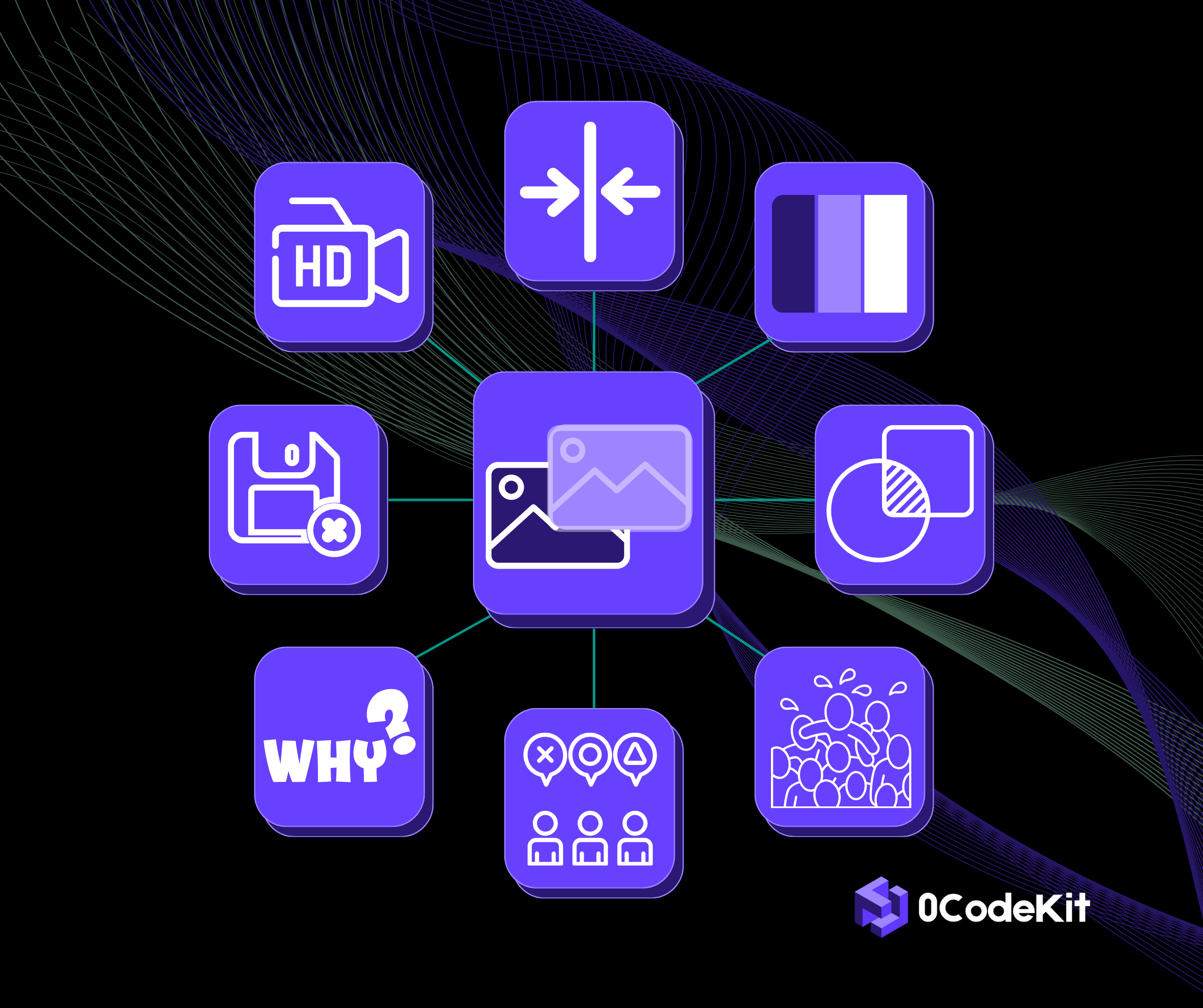
Common overlay mistakes and how to avoid them
Resolution
Mistake: The overlayed images do not have the same or high enough resolution, which can make the final output look blurry or pixelated.
Solution: Make sure that the images have excellent or similar resolutions to maintain clarity.
Alignment
Mistake: Image misalignment can make the final output seem unprofessional and confusing.
Solution: Use grids or guides to align the images or elements of the images precisely.
Colors and tones
Mistake: The colors contained in the overlaid images can be incompatible with each other, shocking the viewer negatively.
Solution: Adjust or correct the scheme colors of an image to produce a pleasing combination. For instance, duo tones or monochrome schemes.
Transparency
Mistake: Adding transparency effects in an image can be tricky. Setting the transparency too high can make the overlayed images or elements difficult to spot, but setting it too low can ruin the desired blending effect.
Solution: Play with the transparency feature wisely until the perfect balance is found.
Overcrowding
Mistake: Overlaying too many elements or images might create a mess, which could make the message difficult to decipher.
Solution: Ensure that the main element or subject is not being overshadowed by adding too many elements around it.
Consistency
Mistake: Using different artistic styles when combining images can make the final output look disorganized.
Solution: Consistent filters and effects must be applied to create a unified style.
Context and purpose
Mistake: Not keeping the context and purpose of the final output in mind can make the design miss its objective completely.
Solution: Set the goals you would like to achieve with this image while also considering your target audience, and make sure that, in the end, the image conveys the desired message.
Save progress
Mistake: Not saving your progress and making irreversible changes can lead to loss of your work.
Solution: Saving versions of your work at different stages can facilitate going back to certain stages in case something needs adjusting.

.png)